The Knot Worldwide
Top of the Funnel — Discovery and Personalization for 16M Couples a Year
Three years owning every surface where newly engaged couples arrive, discover what they want, and decide whether to sign up. 200,000+ vendors, 70% mobile traffic, small shared teams. The AI Style Quiz is the piece in that scope with the most measured impact.
16M
annual visitors
+17%
high-value actions · UI phase
+7.9%
high-value actions · AI phase
−40%
time to complete
- Role
- Senior Product Designer — Global Growth Zone
- Timeline
- Apr 2022 – Jan 2025 · two sequential A/B experiments on the Style Quiz over ~4 months
- Team
- PM, Data Science, UX Research, Engineering Lead, 2 part-time Front-end Engineers
- Tools
- Figma, User Testing, Jira, Confluence, Miro
Impact:
- Scope: 16M annual visitors · 200,000+ vendors · 70% mobile traffic
- Style Quiz phase 1 — UI: +17% High-Value Actions · +10.8% lead submissions
- Style Quiz phase 2 — AI: +7.9% High-Value Actions · +5.6% marketplace lead CVR
- Time to complete: −40%
- Modular landing system: +5% pre-HVAs
For three years I owned design for the top of the funnel of the #1 US wedding marketplace: the surfaces where newly engaged couples arrive, discover what they want, and decide whether to sign up — landing pages, the Style Quiz, onboarding and the inspiration experience. The Style Quiz is the piece in that scope with the most measured impact, and when I picked it up it was doing the opposite of what it was built for.
The Challenge
The top of the funnel decides the volume of everything downstream. The Style Quiz was the clearest failure in it: built to help overwhelmed couples discover their aesthetic, it was suppressing engagement instead of boosting it.
35% abandoned mid-quiz. Couples who finished engaged 40% less with vendors than those who signed up directly. The quiz was hurting, not helping.
Research with 20+ users named the causes: 30+ images per category, a like/dislike interaction that failed on mobile, and results that felt generic.
Key Constraints
- Small shared teams — two part-time engineers on most projects, on surfaces where a mistake shows the same day.
- Can’t break what works — the quiz already generated sign-ups. Two-phase A/B testing to isolate UI from AI.
- 70% mobile traffic on designs built for desktop. Vertical grids prototyped and tested with 8 mobile users before building.
- Stakeholders who did not trust a black box — results designed with match scores and visible reasoning.
Approach & Decisions
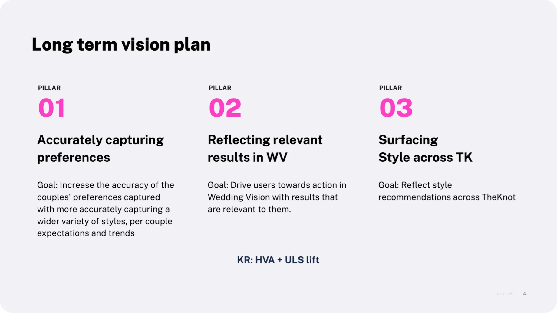
The decision that defines the case: two sequential phases. Phase 1 modernises the UI without AI. Phase 2 layers the personalization on top. Two A/B tests in a row, not one: it isolates the variables, takes the risk out, and ships value at each step. With two part-time engineers it was also the only way to ship anything in six weeks.
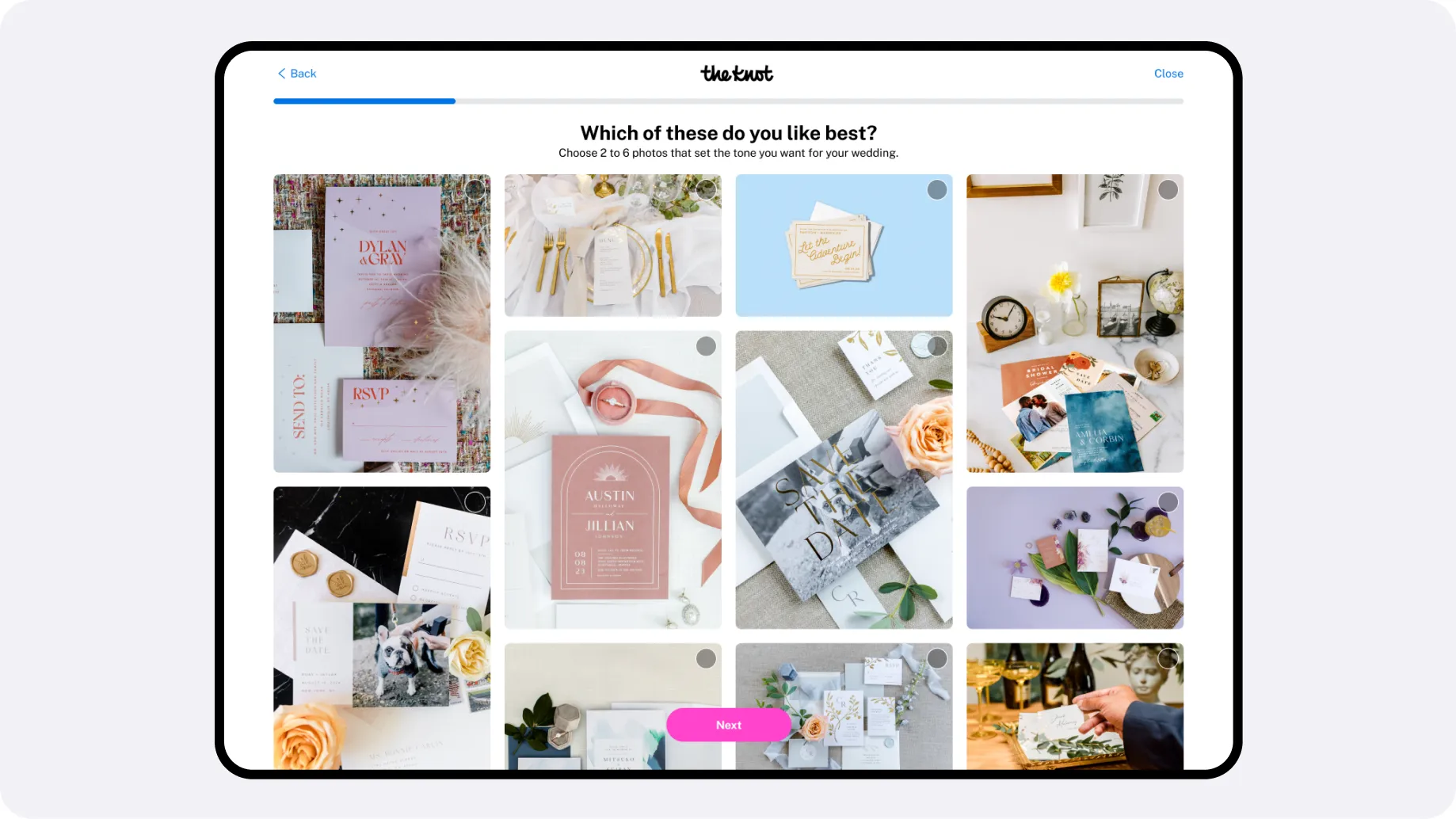
Phase 1 — UI. Replaced “like/dislike” with “pick 2 to 6 favourites”. Vertical scrolling grid on mobile, tested against a carousel with 8 users before anything was built. Hierarchy and navigation modernised.
Phase 1 results: A/B test → +17% High-Value Actions, +10.8% lead submissions. The UI work alone validated the approach.
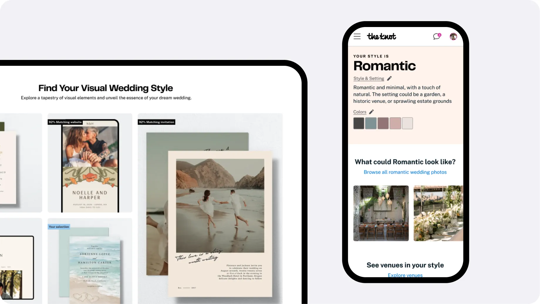
Phase 2 — AI personalization. With data science, a model where each selection shapes the images that come next, and a results page with match scores and visible reasoning — because the internal fear was the black box.
Phase 2 results: A/B test → +7.9% High-Value Actions, +5.6% marketplace lead CVR
The Solution
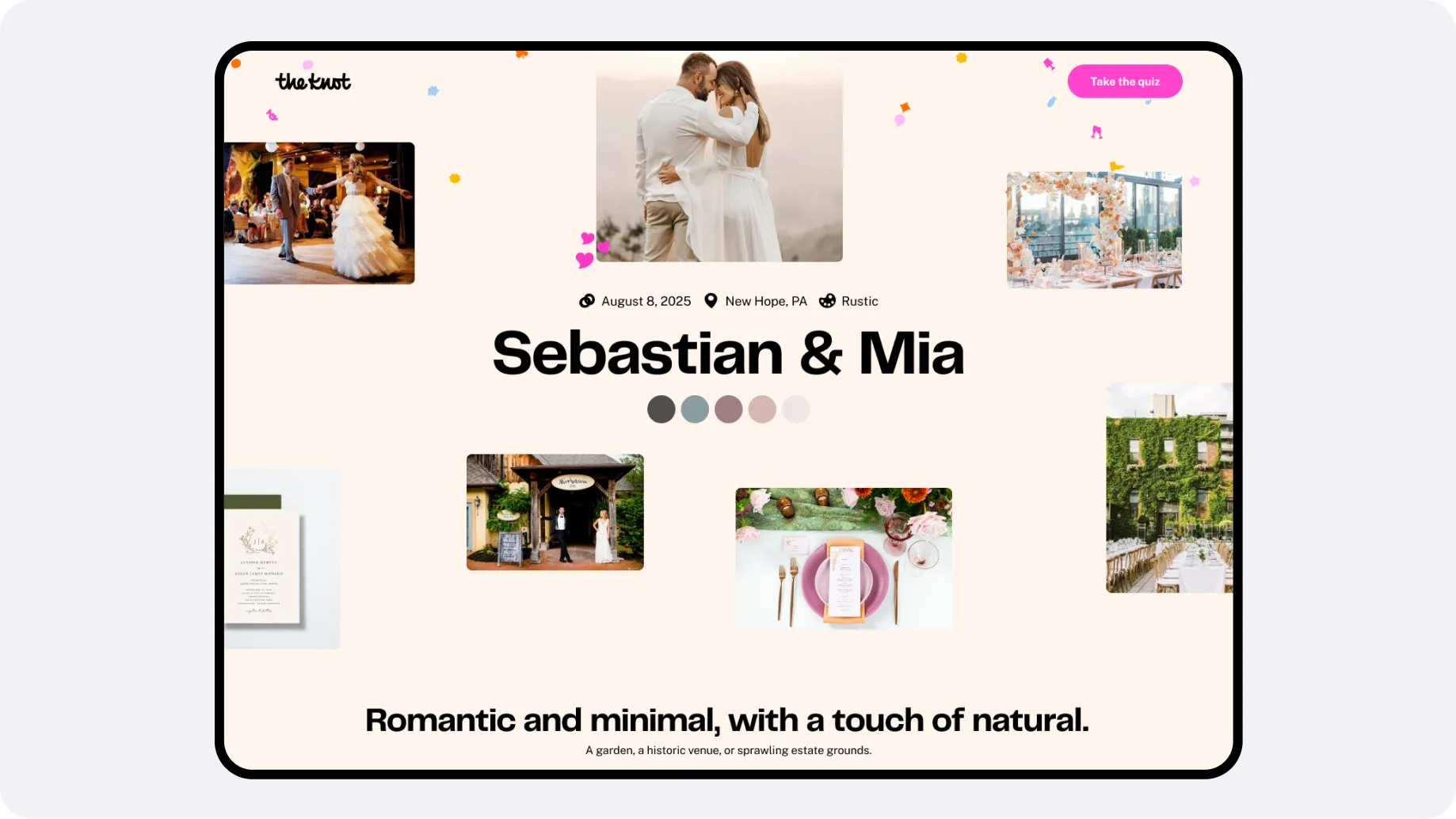
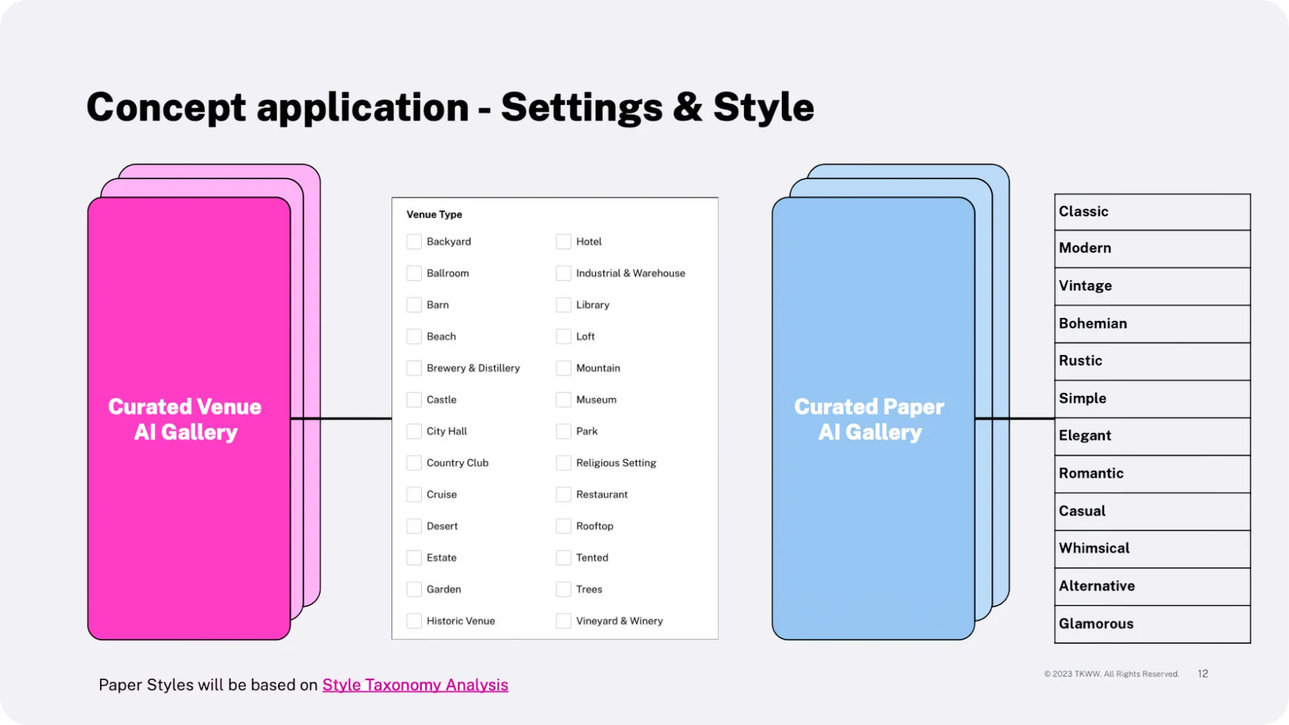
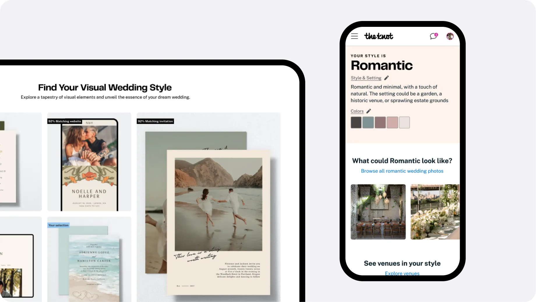
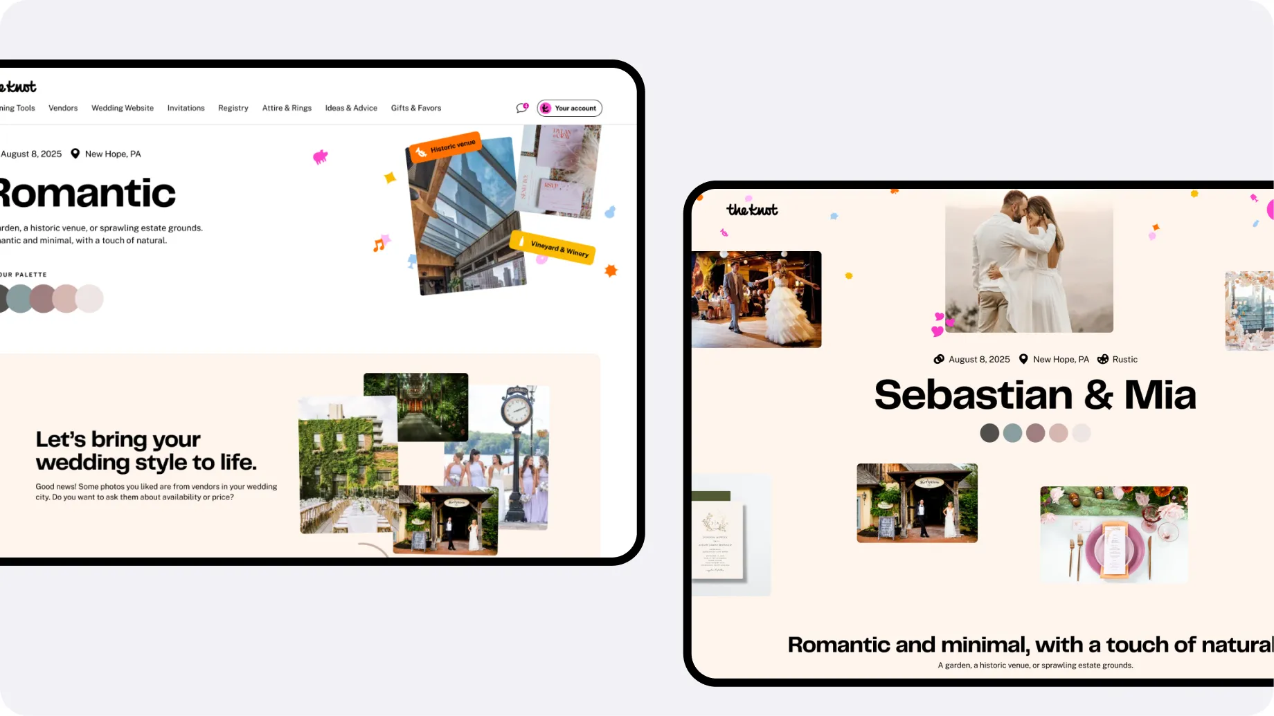
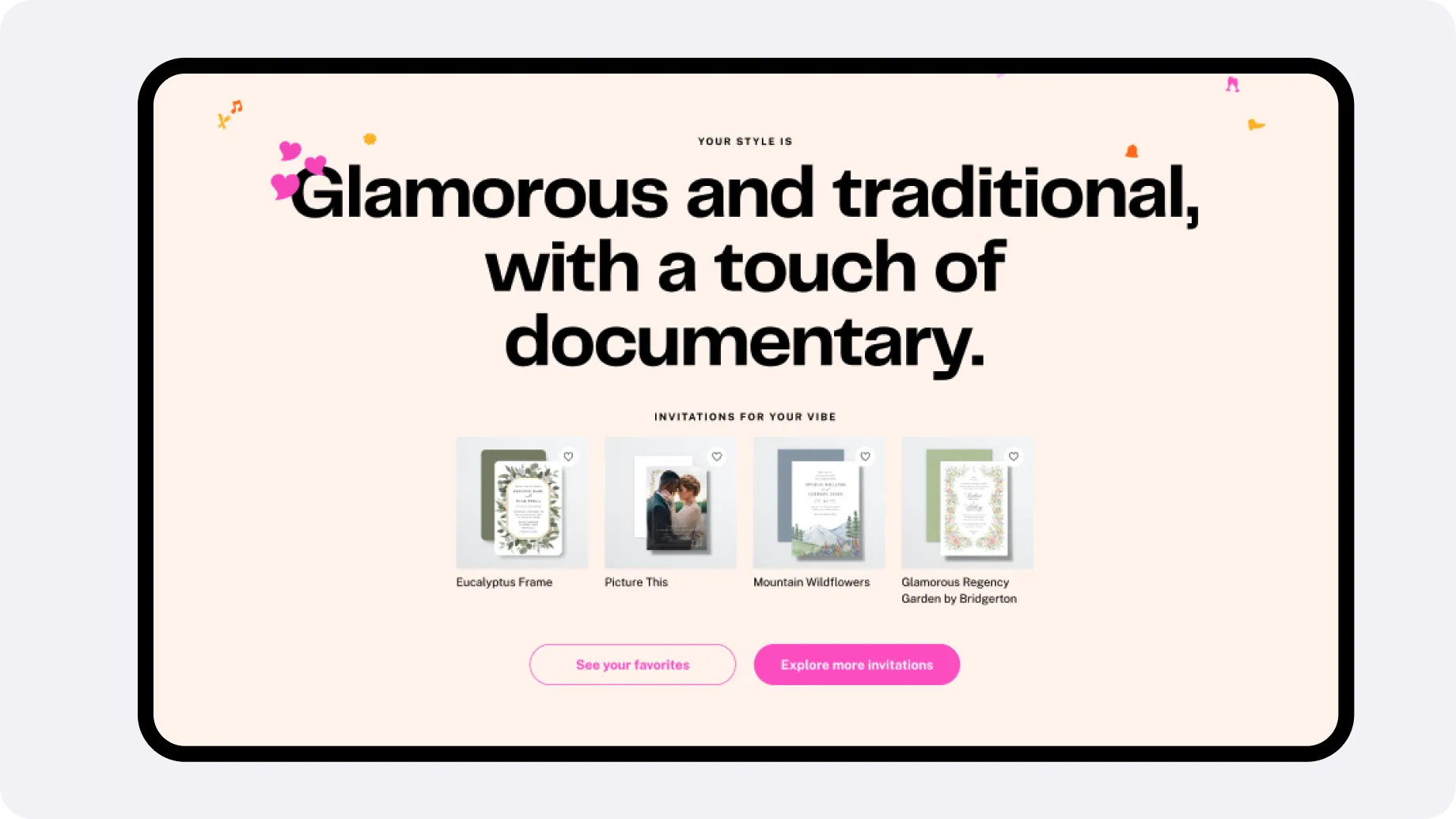
Couples select favourites, the system learns their taste as they go, and the results page returns matched vendors with a match score, a style summary and curated inspiration. The interface never says “AI”. Users just see increasingly relevant options.
Across the same scope: seven standalone landing pages became a modular block system — its own case, Lifecycle Modular System — saving fragmented across seven product areas became one Inspiration Hub pattern, and onboarding became the front door for newly engaged couples.
Results
Style Quiz — phase 1 (UI): +17% high-value actions · +10.8% lead submissions Style Quiz — phase 2 (AI): +7.9% high-value actions · +5.6% marketplace lead CVR Time to complete: −40% Modular landing system: +5% pre-HVAs, maintained from a single source Inspiration Hub: the deliverable was agreement across seven squads, not a metric
“It feels so personalized!” — “The venues were PERFECT for my style” — “Every aspect has been considered”
What I Learned
- Sequential experiments de-risk complexity — two phases let us ship faster, isolate variables, and build internal confidence.
- Invisible AI wins — the interface never says the word. Users just see increasingly relevant options.
- Mobile-first forces better decisions — the vertical grid that won on mobile made the desktop experience cleaner too.
- On a surface this size, alignment is the deliverable as often as the interface is. The Inspiration Hub shipped as an agreement across seven squads before it shipped as a screen.